Project goals:(expand)
The goal of this project is to have a program that is able to simulate one picture as if it had been taken in the environment of another picture. That is, to change the lighting, color, and overall feel of a picture to more closely resemble that of another by using DSP techniques such as fourier transforms, filtering, and sampling. Often times, you are not able to be at a location at a time when the lighting,season, weather, etc are optimal. Our goal was to ensure that you could take a picture at any time and then be able to combine that picture with one that has more favorable conditions, adding the environmental factors that you desire to the original image.
Methods And Results:(expand)
Lighting:(expand)
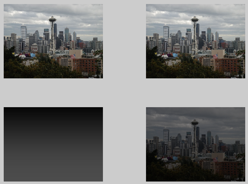
We had achieved the greatest success with transfering the lighting from one picture over to another. To change the lighting of any picture, we took a ratio between the average value of a color gradient that smoothly changed from black to white and the average red, green, and blue pixel values in another picture. This ratio was then applied to each of the pixels in the image that we wished to transform, which would adjust the lightness of each pixel. By adjusting a scalar that was applied to the black to white color gradient, we could control the overall darkness/lightness of the gradient, which would in turn change the ratio and give us a lighter or darker image depending on the value we chose. values greater than 1 would lighten the image and values smaller than one would darken the image.
We then scan through the blurred image and mark every area that gives us a color noticeable color change. This creates a color gradient map (seen below), which not only highlights the areas where colors change, but also shows which areas experience the most dramatic changes by displaying the lines closer or further apart from each other.

 Finally, if we convert this last image to gray scale and replace the black to white gradient that we previously used, we can simulate the lighting of this picture on another picture by using the averaging function described in the previous section, as shown below.
 |
| Transform with plain gradient Source: 1 |
 |
| Transform with gradient*1.3 Source: 2 |
 |
| Transform with gradient*.3 Source: 1 |
 |
| Transform with gradient*.3 Source: 2 |
Using this effect, we could also change the lighting of an image to closely resemble the overall lighting of another image. To do this, we first read in an image in matlab and applied a lowpass filter to it, followed by undersampling and then oversampling the same image. This blurs the image considerably, which is helpful because it lessens the effect of any outlying colors that may unbalance the averages, along with smoothing all color transitions and reducing the number of total colors, making the image data easier to work with.
 |
| Source: 3 |
After this is done we average the color in each of these transition areas, giving us even less colors and creating a smudge effect on the image. Our thinking behind this was that we would be grabbing only the main color in each area that was highlighted above, which would not only give us the main colors in the overall image, but also scales them in a reasonable manner, which will lead to more accurate results when we take a ratio of the average values in this picture.
 |
| Sources: 3,4 |
We found these results to be very promising, as the lighting in the above picture certainly improved. We were not completely satisfied with these results though, since the image still has the dull colors that resulted from the overcast sky, even though we made it appear as though it was a sunnier day on the beach.
Color Transfer:(expand)
The same approach used to transfer lighting can be used with a colored image to transfer the colors, and while it does work to transfer the primary colors, the results are not realistic if the picture has one color that overwhelms the others.
 |
| Sources: 1,5 |
 |
| Sources: 1,12 |
 |
| Sources: 1,6 |
Fourier Transform:(expand)
We tried using the Fourier transform to get a transfer function that describes how a picture changes from one time to another, and then convolve the resulting impulse response with a new picture to transform it in the same way, but we got very poor results from this approach, as going from one picture to another will almost never be a linear transformation. Below shows how noisy the ouput can be, even when we apply the impulse response back to the original image.

After a number of trials, this was the best image transformation we were able to obtain with this function. Because of this, we determined that a fourier transform would not be a suitable method for transforming the images in the way that we had wanted to.
Swap Pixel Values:(expand)
Our final attempt at environment imitation was to take similar colors between two pictures and change one pictures colors according to the ratio's between them.We set up a function that split a picture into three color groups, red, blue, and green. This was done using hsv since it was easy to tell what category the color belonged to according to it's hue value. After that we just made sure the saturation and value were over a certain threshold. If the pixel value was determined to be say red, we took the red value of that pixel and added it to a previous red values, we then had a counter. This allowed us to find average red,green, and blue values for a "red" pixel. Then we could repeat this for the "green" and "blue pixels, to find all the rest of the ratios. We then did the same process for the picture we wanted to change. Then we could find the ratio of rgb values of the certain colors of the two pictures by dividing the average values we had obtained earlier. These ratios were then applied to pixels of the second picture again. So red pixels were multiplied by the red ratio, and same for green and blue pixels. The result is we took the colors from the first picture and put them into the second. This is shown by the red of the roses being changed into the violet color that appears in the second picture. Also notice the green is changed to the green shade present in the second picture. The blue values were very similar so the sky color does not change dramatically.
This lead to some really impressive results, but it only works reliably for images that are fairly similar.
 |
| Sources: 7,8 |
 |
| Sources: 8,13 |
 |
| Sources: 9,7 |
This lead to some really impressive results, but it only works reliably for images that are fairly similar.
Palette Creator:(expand)
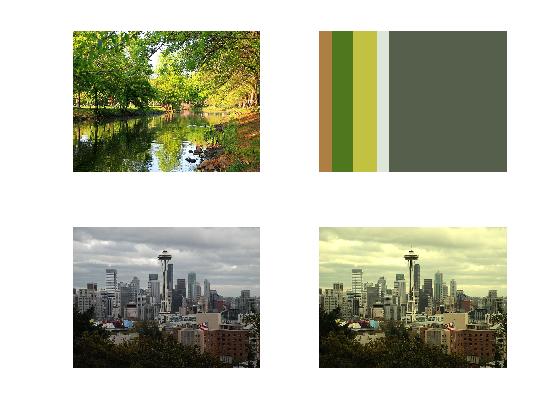
For pictures with a highly dynamic color range, we wrote a function that creates a color palette that we can then use to apply to a picture. This works by scanning through all the pixels and seeing if their color fits into a range of a known color and then recording how often that color appears. for instance, when creating the blue palette, the program will check if the rgb values are in the blue range. after all the blue pixels are found, it creates a square that is proportional to how abundant the blue is and fills it with the average blue color. It does this for the primary colors red, green, blue, aqua, magenta, cyan, and gray and then puts them all in one image. The end result is shown below.
When this was paired with the ratio function described in the first section it led to the following results. Although some test palettes that we created by hand had performed quite well (as you can see in our previous progress report), this function did not lead to images that were noticeably better than their original counterparts. This is due to the fact that we were biased when we created the palettes by hand, and gave colors that were originally overpowering less presence. The program kept the ratio mostly the same, however, leading to only marginal differences.
This function also works for images of any size.
 |
| Source: 10 |
 |
| Source: 5 |
When this was paired with the ratio function described in the first section it led to the following results. Although some test palettes that we created by hand had performed quite well (as you can see in our previous progress report), this function did not lead to images that were noticeably better than their original counterparts. This is due to the fact that we were biased when we created the palettes by hand, and gave colors that were originally overpowering less presence. The program kept the ratio mostly the same, however, leading to only marginal differences.
 |
| Source: 3,10 |
 |
| Source: 3 |
 |
| Sources: 3,5 |
 |
| Source: 3 |
 |
| Sources: 6,1 |
 |
| Source: 11 |
Primary Color Locator:(expand)
The intent of this tool is to locate the primary colors extant in an image and rapidly return gradient swatches corresponding to low, medium and high light intensities.
This method can be juxtaposed with an iterative approach across all pixels, wherein each pixel is checked against a predefined color range and then placed into the appropriate “bin” and averaged.
The advantages of this approach are that it does not rely upon the accuracy of the preset color ranges. We also developed it in such a way as to minimize computation time.
step 1: resize the input image to 900x1200 pixels and then segment the image into 9 equally sized sub images which taken together equate to the original image. You could begin with an image of any size and as many subimages as one would like, however we found that relative to computing time and the data gathered at the end of the process an original image of 900x1200 pixels and 9 subimages worked quite well.
 |
| Source: 5 |
step 2: calculate the variance between pixel values in each sub image. The images with the highest variances (with pixel values spaced furthest from the mean pixel value of the subimage) contain the most diverse array of light intensities. It is also usually the case that the subimages with the largest variance contain the most diverse array of colors present in the original image in ratios that that lend themselves to useful analysis.
step3: From the set of nine subimages we select the three with the highest variance.
step4: We run each image first through a low pass filter and then down sample and up sample the subimage. The lowpass filter removes sharp variations in intensity across the image (high frequencies). The down sampling only takes values from certain pixels in this new image and creates a smaller image. The up sampling then takes the values at each pixel and spreads them out, creating an image that is back to the original size, but only having the pixel values that were found in the down sampled image. However, when the image gets resized, the black borders add a large amount of black near the edges of the image, so we must crop it so that the average values aren’t heavily skewed towards black. This also has the benefit of reducing the size and complexity of the image, making it even easier to work with.
After taking subimages and then down and upsampling we end up with an image 120x220 pixels rather than 900x1200.
step5: Taking the sample images we developed a sort of gradient that identifies the dominant colors within the image and the transitions between dominant colors. We accomplished this using a grayscale image, which is only a 2-dimentonal image of intensity values. The transitions in intensity tend to correspond with changes in color. Using this gradient we were able to isolate the dominant colors present in each subimage.


step6: We looked at the colors in between regions of transition, averaged them, and then grouped them in terms of low, medium and high intensities.


Some Cool Byproducts:
 |
| Source: 6 |


 |
| Source: 12 |


Understanding Results:(expand)
We tried numerous methods to imitate one picture's environment in another, and though what may be considered a successful conversion and what may be considered unsuccessful are subjective, all can agree that we were met with varying degrees of success. What we learned is that there are many factors that have an affect on how a picture looks and it is no trivial matter to transfer all these factors to another picture. Lighting does not react the same way in two different environments and colors do not react the same way to different amounts of light. More specifically, while one image environment may constitute a linear system for certain transformations, transformation between different images containing different objects are not linear processes. Also we realized that color is an especially tricky quality of images to manipulate. It is primarily the intensity values of particular images that are able to be manipulated with relative ease, hence the reason most image processing is done in grayscale, which simply measures light intensity. The edges created by changes in intensity are able to be manipulated in the frequency domain with relative ease, however when attempting to manipulate color the frequency domain seems to be at best indirectly useful. Because of this, we were unable to find one single function that we could apply to any picture to get the best result. This is what contributed to us having quite a few differing functions. One function would work great for one type of image but could produce wild results for another. Each function had its strengths and limitations, but we were able to produce something that was as close to what we hoped for, for nearly any kind of transformation.
Sources:
1: Seattle skyline - http://i356.photobucket.com/albums/oo1/DizzyTai/1753506400_983b2c92be_b.jpg
2: Mountain Range -http://wallpaperscraft.com/image/sun_light_beams_meadow_glade_summer_day_53997_3840x2400.jpg
3: Fenced Path - http://www.wallpapermania.eu/images/lthumbs/2013-08/5801_Path-surrounded-by-a-wooden-fence-wonderful-nature.jpg
4: Cloudy Beach - http://static.panoramio.com/photos/large/19891863.jpg
5: Neon Tropical Scene - http://wallpapersinhq.com/images/big/tropical_beach-974055.jpg
6: River Scene - http://www.tapeteos.pl/data/media/597/big/wiosna_2560x1600_008.jpg
7: Tulip Field - http://wallpaperscraft.com/download/tulips_flowers_golf_sun_sky_clouds_mood_22475/3840x2400
8: Pink Flowers - http://static.hdw.eweb4.com/media/thumbs/1/107/1068773.jpg
9: Single Rose - http://www.fabiovisentin.com/photography/photo/12/red-roses-02721_med.jpg
10: Van Gogh Painting - http://teachers.sduhsd.net/cfox/images/bandage.jpg
11: Khali Desert - http://en.wikipedia.org/wiki/File:Rub_al_Khali_002.JPG
12: Tropical Scene - http://wall.alphacoders.com/big.php?i=402163 13: Office Building - http://s3.evcdn.com/images/edpborder500/I0-001/002/940/694-9.jpeg_/pacific-design-center-94.jpeg
Fantastic
ReplyDelete